Brand Essence
Brand Evolution
Who we’d like to be
We heard a genuine desire to elevate and express love in all of its many forms, to better connect with women in the entertainment space and in life in this modern time.
Live up to the quality of our content
Our brand expressions should feel cinematic, confident, premium, and relevant to the caliber of our shows, talent, and titles.
Keep the spotlight on the story
We make sure our visual system grounds our content and our characters. It should never overpower or pull focus away.
Hallmark Logo Evolved
Logo Refreshed
Logo + Tag Line
Illuminate
Light is the language of modern storytelling.
Cinematic, Luminous, Sophisticated,
Inspired, Warm
At an elemental level, our stories are made of light; characters are captured and recreated in light.
Because light is a spectrum of additive color, our content becomes the source of illumination, which shines through the Hallmark universe.
Our design bridges content and brand; furthermore, it echos the emotional connection from the look and feel of the content.
Typography Family
Motion Behavior
Font: GT America Bold + GT America Light
Tune in + Title create an eye-catching horizon axis.
Illuminates outward with a clean flowing layout.
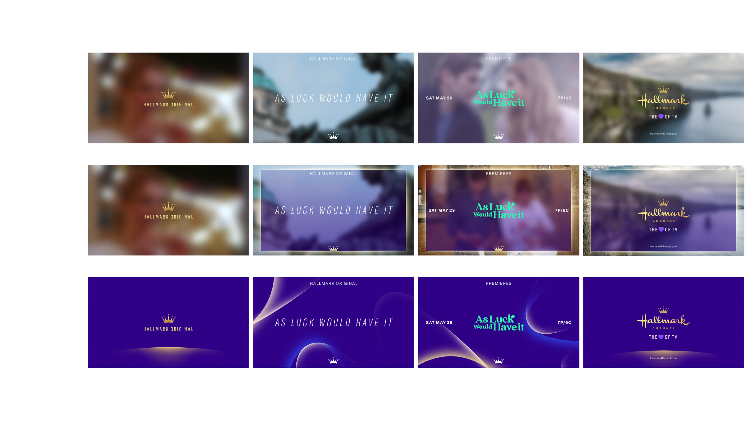
Flexible Promo System
Top Tag - Original Series
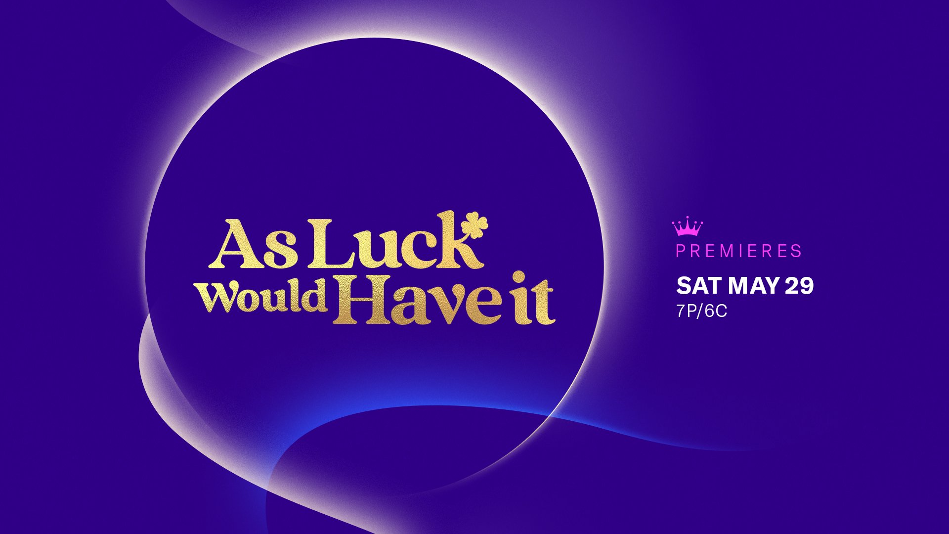
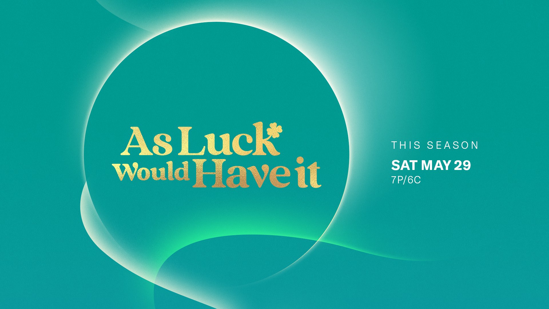
Title Card - Seasonal Franchise
Seasonal Icon + Seasonal Franchise Logo


Seasonal Icon + Branding Font
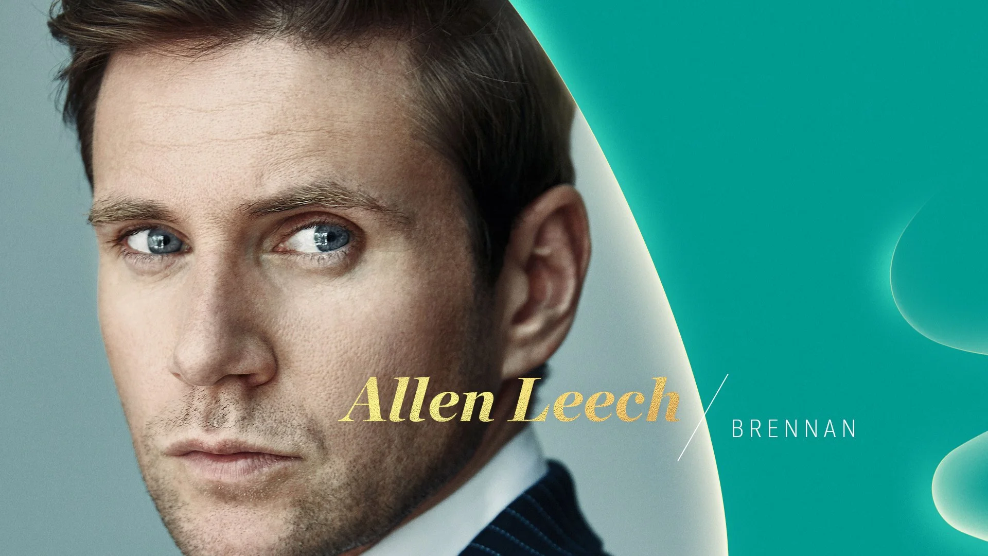
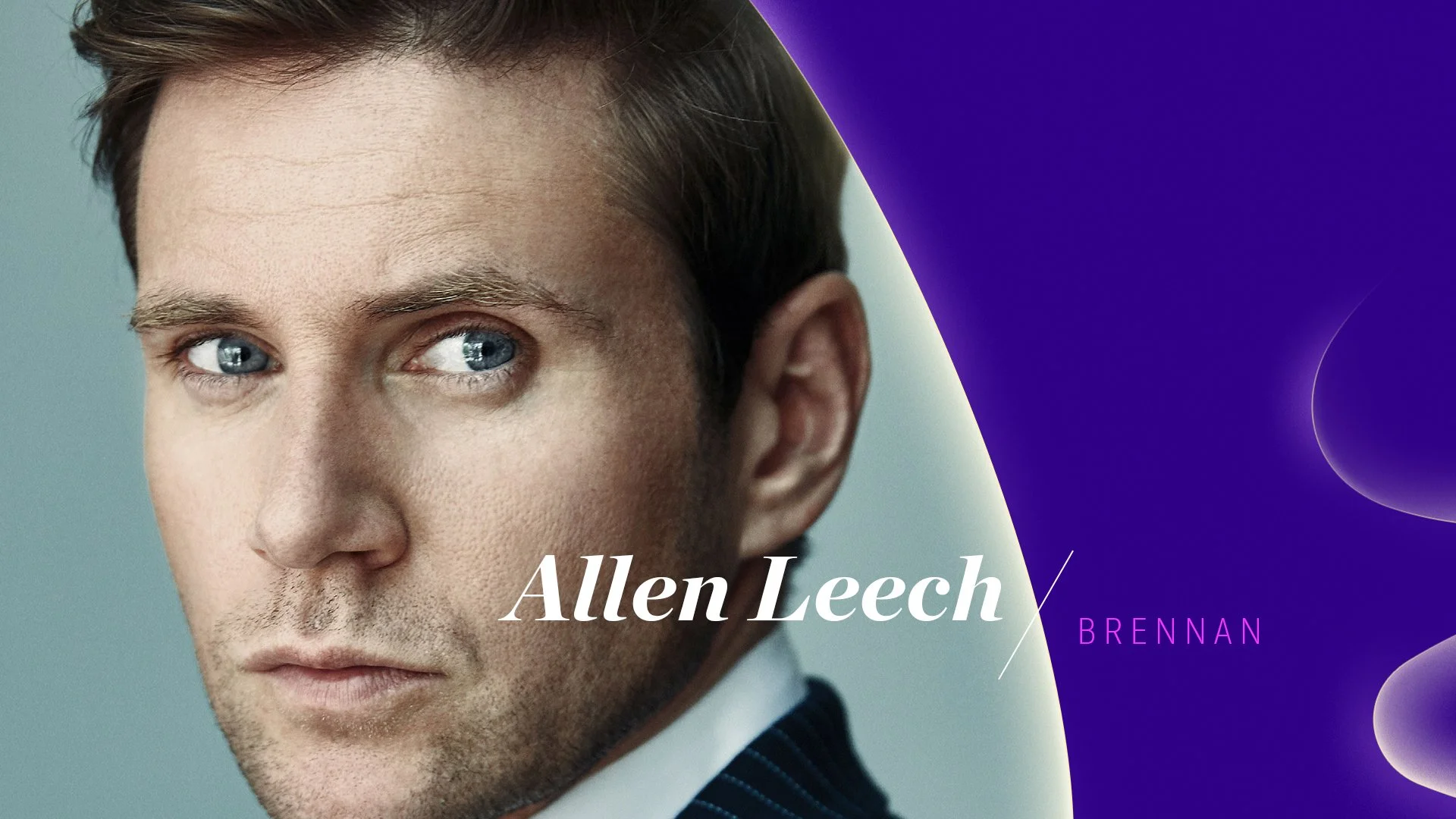
Talent ID
Seasonal Franchise - Spring Season, March to April
Photoshoot Guideline: Close-Up on the Talent Solo Shot
Cooler Skin Tone Lighting / Color Correction
Main Theme - Original Premieres
Tune-In
Low Touch - Over Footage Treatment
High Touch - Full Color Page


